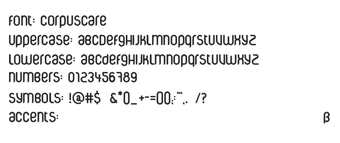
Narrow rounded display typeface for titles and branding
CorpusCare, designed by CorpusCare (Peter Fritzsche), is a stylized display typeface for titles, logos, and editorial packaging. The font emphasizes narrow, rounded sans-serif letterforms and airy spacing to create a distinctive graphic voice across display work. It ships as TrueType (.ttf) with Regular and Light weights and a small file size for quick loading. The font targets graphic designers and brand managers who need a lean headline face for visual identity.
CorpusCare reshapes headline typography with a narrow, airy voice
CorpusCare is built for display use: its narrow proportions and rounded terminals produce an offbeat, graphic presence suited to titles and packaging. The face is described as having an "airy construction," which supports high-impact headings rather than long text blocks. Designers aiming for a distinct visual identity can apply the font at large sizes where the condensed shapes and spacing register clearly.
How much typographic control does the font provide designers?
The package includes Regular and Light weights, which give basic hierarchy for headings and subheads. Character coverage is modest, roughly 102 characters, so typographic work that needs extended language support or stylistic alternates will be limited. For projects that require additional weights, italics, or expanded glyph sets, the family does not offer those extras out of the box.
Is installation and daily use straightforward for design workflows?
The font is supplied as TrueType (.ttf), ensuring wide compatibility with desktop design suites and standard Windows workflows; installation on Windows follows the usual extract-and-install step. Its lightweight file size makes it quick to load inside layout applications and avoids adding significant startup delay when opening design documents that reference the face.
Does CorpusCare fit across platforms and production constraints?
CorpusCare supports Windows and macOS environments that accept .ttf fonts and integrates with common graphics software. The design is optimized for display contexts, so production teams should reserve it for headlines, logos, or media packaging where a narrow, rounded sans-serif is appropriate. Projects requiring broad international character sets or multiple family weights need supplementary fonts or licensing options.
A focused display face that suits headline-driven identities
CorpusCare is a distinctive choice for designers who need a narrow, airy headline face with a clear graphic personality; its commercial history with brands such as H&M and Suzuki shows real-world application in branding. The personal-use license restricts direct commercial deployment without a separate agreement. Tip: apply the font at display sizes and pair it with a neutral text face for readable body copy. It fits teams seeking a memorable display voice.